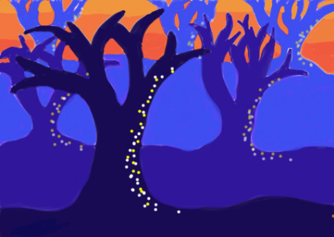
This is my Spooky Tree drawing that was done on an iPad with a stylus. I made the trees blue and the sky orange to add somewhat of a color contrast. I made smaller trees in the back with a lighter color, and the trees progressively got darker and bigger to make it look like the trees were certain distances apart.
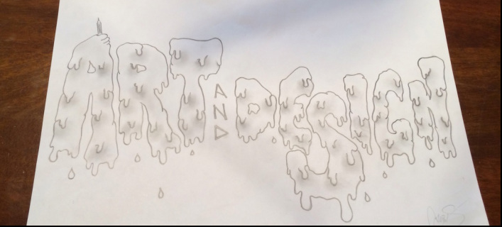
This is my mastehead project, and probably my favorite project I have done so far. I love drawing fonts, especially the font in this, so I was excited for this project. In it I used shading to make the melting letter pop more, and look more realistic.
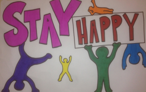
This poster I did was supposed to display a positive message, and clearly my message was too stay happy. I used a lot of color to catch the eye of those looking at it, I used big and small people to add a distance effect to it and I made the letters especially big so the message was clearly displayed.
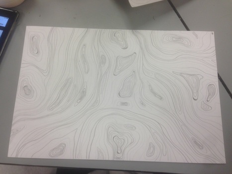
This image that I drew for my line project was solely based off of curved lines. The reason behind that is because his drawing was supposed to look as if it had movement and texture within in. In order to accomplish that, you had to draw some lines dark and some lines light. Where the dark lines were they tended to be closer together, more compact, where the light lines were they tended to be more spread out, distant. All in all after completing this project I would say that I am relatively happy with this.
